Creating a Banner For the Rooftop Restaurant

Introduction

You will need the two files contained in this zip file for this tutorial.

A standard part of most web pages is a top banner. This is what most people will notice and read first when they come to the page.

In this exercise you will use Fireworks to build a banner for a fictitious restaurant, The Rooftop Restaurant. This banner would be used on the page that describes one of their specials.

This exercise will cover the following tools, techniques or topics:

  • File naming conventions
  • Setting up a simple web site folder structure
  • The color palette
  • Creating rectangles, copying them, and setting their color
  • Specifying the size and position of a shape
  • Creating and kerning text
  • Importing and combining multiple images
  • Creating a transparent GIF file
  • What slicing an image means and why it is used
  • Slicing an image with Fireworks
  • Assigning a URL to a slice
  • Setting export options on a per slice basis
  • Exporting sliced images along with an html file that has the code needed to reassemble the pieces of the image
  • Testing a sliced file's reassemble code


File and folder names

It is a good idea to establish and consistently use file naming conventions. These are rules that are established to help minimize confusion. When your site grows to dozens, hundreds, or even thousands of files, it is good to name the files and their folders systematically so that they are easier to locate and also easier to identity without needing to open them up and inspect them.

First and foremost: never have any blank spaces in your file or folder names. This is because many servers use the UNIX operating system (instead of Windows or Mac) and UNIX can have big problems with spaces in file and folder names.

UNIX interprets spaces as delineations between things: if there's a space in a folder or file name, UNIX assumes that the name of one thing has ended and the next word is the name of something different.

Also, UNIX is "case-sensitive" - meaning it sees an upper case letter as a different character than the lower case of the same letter. If you stick to generally using lower case letters, there is less of a chance for confusion. Traditionally, lower case is used but there are many naming conventions that mix the two.

The most important thing about file naming conventions is to establish rules and then stick to them consistently. Also, use words that will make it easy to determine the type of information that is in the file.

For example, you will be instructed later in this exercise to save a file. The file name you will be asked to use combines the words: Special and Page.

Following are examples of several possibilities for naming such a file, each using a different file naming convention. Note how an underscore ( _ ) can be used to indicate a space and how an upper case letter can be effectively used to indicate the start of a new word:

  • specialPage.htm
  • SpecialPage.htm
  • Special_Page.htm
  • SpclPg.htm
  • ...etc.


Lay the foundation

Let us now create the folder structure that we will use for this exercise's files. This will be a very simple yet sensible folder structure. The way that you name and structure the hierarchy (arrangement) of your folders needs to be easily understood by you and any others who work on your site.

  1. Using whatever method you're accustomed to, create the following folders...
    • For example, on a PC: you can use Windows Explorer (and that's not the same thing as Internet Explorer) or My Computer.
  2. Create a folder named: rooftop.
  3. Inside of the new rooftop folder create two new folders. Name one of the folders html and the other one images.

Create the file and background

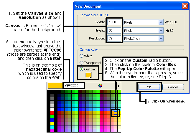
Start Fireworks. In the File menu select New. Then...

Top


Make the rectangular background shapes

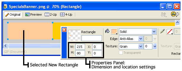
We will now make some decorative rectangles for our banner.

  1. Select the Rectangle tool. It is in the Tools panel in the Vector section, below the tool with the diagonal line (see illustration). It has a white-ish square icon (not a blue, green, or dashed line square).
    • If you don't see the Tools panel, use the Window menu to select Tools (not Toolbars).
    • If you don't see the Rectangle tool on the Tools panel where indicated in the illustration, either:
      • Press the letter U on your keyboard repeatedly until you see it,
        or...
      • Click and hold on whatever button is displayed in the Tools panel at the location illustrated. A menu will appear. Select the Rectangle tool in that menu.
  2. Next, set the Fill color:
    1. Look in the Tools panel for the Colors section, near the bottom. (see illustration)
    2. There are two bucket icons in that section.
    3. Click the Color Box (the square) to the right of the lower bucket icon.
  3. The Pop-up Color Palette will appear. Set the color to #FFCC99 using the same technique you used to set the custom canvas (background) color earlier in this exercise. This color will be very slightly different than our background color.
  4. With the rectangle tool selected, make the rectangle: just click and drag over the yellow background you created. It doesn't matter what size it is or where it is located yet. Get a shape roughly like the one pictured here:
     
  5. Once you've made the rectangle, select it with the Pointer (black arrow) tool and click-drag it into a position about in the middle of the yellow background.

  1. We will now adjust the rectangle's size and position using the Properties panel (see illustration above). If you don't see the Properties panel, in the main menu select: Window -> Properties.
  2. Using the Pointer tool, make sure that the rectangle you just made remains selected: when an object is selected there will be little light blue squares on each of its corners.
  3. The Properties panel displays the dimensions and location of any selected object. With the rectangle selected, just click in the height and width windows to modify the size. Set it to 215 wide by 80 high (the height is the same as the background's height).
    • Note that all sizes are in pixels, the basic and smallest unit of all digital images.
    • FYI: the word "pixel" is derived from the two words: Picture and Element.
  4. Set the position to be Y = 0, if it isn't already. This will position the rectangle's top and bottom edges to be flush with the top and bottom boundaries of the background.
  5. In order to maintain the vertical position, use the left or right arrow keys on your keyboard, pressing them repeatedly until you have the rectangle in a position roughly in the middle of the banner. If you press and hold down the Shift key, then each time you press an arrow key the shape will move 10 pixels. Without Shift it will move only 1 pixel per key press.
  6. Using the Edit menu, Copy the rectangle and Paste it: the new rectangle will be directly on top of the one you copied, so you won't see it. However, it ought to be automatically selected as soon as it has been pasted.
  7. Leaving the new rectangle selected, set its color using the Fill color chooser in the Tools panel that you used before. Select #FF9966 in the Pop-up Color Palette that opens; this color is probably one color up and to the left of the color you chose for the previous rectangle. Alternatively, you can manually type the color number in, then press the Enter key on your keyboard to set it.
  8. Using the arrow keys on your keyboard, move the new rectangle to a position slightly to the left or right of the first rectangle. The exact positions of the rectangles are not critical, they are purely decorative. You can reposition them later.
  9. Now you should have two rectangles with slightly different colors. The horizontal ("X") position of the rectangles is not too important, but the "Y" value of each rectangle in the Properties panel ought to be 0 (zero) and their "W" (width) and "H" (height) ought to be the same: 215 and 80 respectively . Your file ought to look something like the following (but not as small as this reduced image size):
  10. Take a moment to save your file in Fireworks' default format PNG. Save it in your images folder. Name it: BNR_yourlastname. The .png file extension will get added automatically (PNG stands for Portable Network Graphics).

Top


Making the text

  1. Set your view magnification to 100% by clicking on Ctrl-1 (that's a one) or using View -> Magnification -> 100%. It is not a good idea to judge the appearance of text at anything other than 100%.
  2. Select the Text tool. It is the button with the A icon in the Tools panel (see illustration of Tools panel above).
  3. Click anywhere in the image area.
  4. Type the words: Today's Special.
  5. Make sure that the text you just created is selected (blue outline).
  6. In the Text menu select Editor.
  7. The Text Editor dialog box will open.
    • Note: Many of the settings made in the Text Editor can also be done in the Properties panel, however I prefer the Text Editor because you can move the text around in the main window and edit the text at the same time.
    • However, many of the changes that are made in the Text Editor will only appear in the Fireworks main window, not in the Text Editor. This includes kerning, baseline shift, horizontal scale (stretch), and anti-aliasing. Therefore, check results in the main window, not in the Text Editor.
  8. Click-drag over the text in the Text Editor to select it all.
  9. In the top left corner of the dialog box select any font you like from the font menu.
    • You can use any font you like because the text will be embedded (made a part of) the image, therefore you are not relying on the client computer's available fonts (unlike html text).
  10. In the box to the right of the font listing, set the size to about 62.
    • Any size is acceptable however the text must remain within the boundaries of the background (the yellow Canvas) area.
  11. Next, use the Color Box in the Text Editor to set the text color to one similar to the color in the illustration below (#660000 - which is in the top row, sixth from the right).
  12. Set the font to be bold (using the "B" button) and italic (using the "I" button). Don't close the Text Editor yet, there's more to be done with it next.

  13. Continuing in the Text Editor, find the drop down menu that controls the text's Anti-Aliasing Level setting. It's probably set to the default of No Anti-Alias.
    • Anti-aliasing means creating a blend of color between the foreground (text) color and the background (Canvas) color to give the visual illusion of smoother edges on diagonal or curved edges in the text.
    • IMPORTANT: As mentioned previously, you can only view the effect of the Anti-Aliasing Level in the main window of Fireworks, not in the Text Editor. Also, your view size must be 100% in order for you to make an accurate judgment, as specified in Step 1.
    • Change the Anti-Aliasing Level to one that you think makes the text look the best. Choose from the top four options in the drop-down menu. Those options are listed below:
      • No Anti-Alias
      • Crisp Anti-Alias
      • Strong Anti-Alias
      • Smooth Anti-Alias
  14. Continue to leave the Text Editor open.


Kerning

To kern means to increase or reduce the gap between selected letters to make words look better. This is important to do with large text such as what you have created. The Text Editor allows you to do this.

  1. First, click between the letters that you want to adjust. You might want to try adjusting the gap between the "y" and the apostrophe - which may have too wide a gap.
  2. Look in the Text Editor on the left side underneath the font name for the following characters: A\V.
  3. To the right of these letters, click on the downward pointing arrow next to the percentage selection box.
  4. Use the slider that appears to make adjustments until it meets your approval visually.
    • You will not see the gap between the characters change in the Text Editor, but you should see the change in the text in the file's main window.
    • A setting of only -4 or so may be all that you need.
  5. Click OK to close the Text Editor.
  6. Use the Pointer tool to select and position the entire block of text where you want it.
    • You can refer to the illustration of the completed example much further down on this page for an approximate position. NOTE that the example image is reduced in size and therefore probably appears much smaller than your file will appear.
    • If you can't see your entire banner but would like to in order to make it easier to position the objects, do the following:
      • Ctrl + 5 will reduce the magnification of your image to 50%. This should allow you to see the entire banner.
      • Then use your Pointer tool to position the objects.
        • You may want to temporarily use the Select Behind tool to make it easier to select the rectangles that are behind the text in order to move them. You can get this tool by clicking and holding on the Pointer tool in the Tools panel and selecting it from the menu that appears.
        • To use the Select Behind tool to select a rectangle (in order to move the rectangle), click once or twice on the rectangle until you see the little blue squares on the rectangle's corners, indicating that it is selected. Then use the arrow keys on your keyboard to move the rectangle left or right into an appropriate position.
        • When done using the Select Behind tool, reselect the Pointer tool in the same way that you selected the Select Behind tool.
      • Return magnification to 100% using Ctrl + 1 (that's a number one).
  7. Save the changes that you have made so far by using:
    • Ctrl + S or...
    • File -> Save

Top


Making a transparent GIF file of a sun logo

Before
Transparency
Inadequate Transparency
Adequate
Transparency

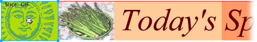
The GIF image file format allows you to select one or more of the colors in an image and remove them, leaving transparency where the color had been. If the image is then superimposed over a color background, the background color will be seen through those transparent areas.

We want the yellow color of our banner's background to be seen through all but the darkest parts of an old-style illustration of the sun that originally has a white background.

  1. Open the image file of the sun that was included in the zip file that is linked to near the top of this page. The image file is named: SunBefore.gif
  2. In Fireworks, open the file that you just saved.
  3. Then, go to: File -> Image Preview
  4. In the Image Preview dialog box that opens, in the upper left section, from top to bottom make these settings if needed:
    1. Format: GIF
    2. Palette: Websnap Adaptive
  5. Then, underneath the color palette area, select: Index Transparency.

Fireworks assumes that we want to make only the white color transparent, because it's the predominant color. Therefore, initially only the white area becomes transparent. Transparency is traditionally represented in programs such as Fireworks by a gray and white checkerboard pattern.

Look at the area on the left side of the dialog box that has little gray color swatches. These are the colors that the image consists of. If you look closely you will notice that the swatch for white has become a gray and white checkerboard pattern. You will also see the gray and white checkerboard behind the sun in the image preview area on the right side of the dialog box.

There is a problem however with setting only the white area to be transparent. When the image is placed against the yellow background, a fringe is visible (see middle illustration above). This fringe consists of the light gray color pixels that remained in the image after the white pixels were removed when the transparency was initially set.

We need to select the light grays that are used in the image and designate that they also be made transparent. The darker grays that remain will be enough to adequately represent the image of the sun.

  1. Use the "+" eyedropper tool on the left side of the Import Preview dialog box to select (by clicking on them) all but the two darkest grays in the group of color swatches. The gray swatches should be in the area above the eyedroppers.
    • This step will make the gray colors that get clicked on transparent.
    • This is being done because removing the lighter grays by converting them to being transparent will prevent the fringe of light pixels from being seen when we put this image on top of the banner's yellow background color.
    • All but the two darkest grays ought to be transparent now.
  2. Luckily for you, this file is already the exact size for the height of the banner: 80 pixels high, so you need not be concerned with changing the image size.
  3. Click on the Export button.
  4. In the Export dialog box:
    • Set the File name to be: Sun.
    • Save the file in your images folder.
    • The .gif file extension will be added automatically therefore you do not need to add it.
  5. Click on Export.
  6. If the Image Preview dialog box remains open, click on OK to save the export settings that you made.
  7. Save SunBefore.gif and close it.

Top


Put the sun on your banner

  1. Open the file you just made (Sun.gif) in Fireworks using File -> Open.
  2. Position your banner so that both it and the Sun.gif file are visible.
  3. Select the image of the sun by clicking on it once with your Pointer (black arrow) tool. A thin light blue borderline indicates that the sun is selected.
  4. Then use Edit -> Copy to copy it, or else simply use Ctrl + C.
  5. Go to your banner-in-progress file.
  6. Paste the sun anywhere on the banner using Edit -> Paste, or Ctrl + V .
  7. Use the Pointer (black arrow) tool to put it on the far left side of the yellow background, as far left as it will go and remain visible.
  8. With the image of the sun on the banner selected (blue outline) use the Properties panel, to set both the X and the Y to 0 (zero).


Add another picture

  1. Now put the file above (asparagus.jpg) in your images folder.
  2. Open the file in Fireworks using File -> Open.
  3. Then select the image by clicking on it with the Pointer tool. It should have a thin, light blue borderline around it indicating that it is selected.
  4. Use the Edit menu to Copy the image.
  5. Go to your banner file.
  6. Use Edit -> Paste and paste the image anywhere on top of the yellow background.
  7. Use the arrow tool to drag it to a point adjacent and just to the right of the sun image.Try to somewhat mimic what you see in the image below.
  8. Now position the rectangles and text until you're happy with them using the Pointer tool.
  9. If you want to readjust the stacking order (make one object appear in front of the others), select the part you want to change and use Modify -> Arrange.
  10. Now save the banner file. It should look something like the image below (but larger).

Top


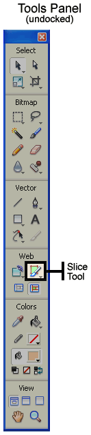
Slicing the banner up to add a link and help the files load faster

We will now prepare the banner as if it were to be used by others at our company who are working on the restaurant's site. We will slice it and add a link to one of the slices.

Slicing is used for a few reasons:

  • It can divide up a single image into parts so that links may be added to just one section of the image.
  • It is used to optimize (set the file type and size in KB) different parts of an image using different settings.
  • It can also help the overall image seem to load faster because smaller images load in their entirety faster than larger ones.

Slicing divides up the image into several smaller image files. It also generates an html file with code instructions on how the slices are to be reassembled using an html table.

A table is a set of rows and columns created in html that you can use to hold images, text, and other objects. Each compartment of it is called a cell (similar to Excel).

There are three table tags: <table>, <tr> (table row), and <td>, which stands officially for table data, but means a cell. Our entire table (code and images) can be used in other html pages if so desired. That's what might be done in a situation such as this.

  1. The first step is to select the Slice tool on the Toolbar (see illustration).
  2. Next, click-drag over the sun from its upper left corner down to where it meets the bottom left edge of the image of the asparagus.
  3. The image area over the sun ought to now be a transparent green, indicating that it will be made into a slice and also making it available as a hot spot for linking to another web page.
  4. Select the green slice using the Pointer tool. The green area should have a light blue borderline if it's selected (see illustration above).
  5. Look at your Properties panel (if you don't see it, go to Window -> Properties). Check that the slice is 80 pixels high (H) and also in position X=0 and Y=0. If not, then enter those numbers.
    • You can also use the Pointer tool to click and drag on the handles on the slice's corners to adjust its shape. However it can be a little awkward to adjust the size with precision in this manner.
  6. To create a link, enter into the Link field in the Properties panel the web address of an actual web site so that we can test the link, being sure to include the prefix: http://
    • Example: http://www.google.com
    • Note: typically this part of a web page would usually provide a link to the site's home page.
  7. Also in the Properties panel is set the Target to _blank. This will cause the link to open in a new window.
  8. Next, with the Slice tool selected, click, and drag over the photo of the food. Now you should have a second green area indicating that the photo will be a separate slice. We will optimize the photo as a JPEG and the other slices as GIF files in a moment.
  9. Finally, click and drag over the remainder of the banner, which will be the entire area to the right of the photo. Now you should have a total of three green slices.
  10. Set the optimization settings using the Optimize panel. If you don't see it, go to the Window menu and select Optimize.
    • Using the black arrow tool, click on each sliced section, one at a time, and check its settings.
    • Set the slice over the photo of the asparagus to JPEG - Better Quality, 80% Quality.
    • Set the other two slices to GIF WebSnap 128.
    • Leave the other settings as you found them.
  11. Once that's done, go to File -> Export which will open the Export dialog box.
  12. In the Export dialog box, make the following settings (and don't save the file until you're told to do so):
    • Save In:
      • Create a new folder in your images folder.
      • Name the new folder slices.
      • Then open the slices folder so that you will save the exported files in it.
    • Continue to set the Export dialog box as follows (some of these settings may already be established so you probably won't need to change them all):
      • File name: banner (you don't need to add extensions - Fireworks will do it for you).
      • Export: HTML and Images
      • HTML: Export HTML File
      • Slices: Export Slices
      • The checkbox for Include Areas without Slices ought to be checked.
  13. Click on Export and remember where you are exporting the files to.
  14. Open in your browser the html file that was just created, using the browser's menu: File -> Open.
  15. You should see it all perfectly reassembled and the link ought to work. The area outside of the banner will probably be colored the same as the banner's background color. This is normal. In cases such as this, the table containing the banner is all that would be imported into Dreamweaver's html file.
  16. Online students: send me the Fireworks .png file only. It should be named BNR_yourlastname.png

Congratulations, you did it!


Top

© 2005 Dan Hitchcock Vaughan and its licensors. All rights reserved.