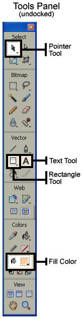
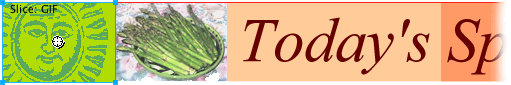
Creating a Banner For the Rooftop Restaurant

Introduction

The image above is a scaled down version of the banner that you will be creating in this tutorial. You will need the two files contained in this zip file for this tutorial. Be prepared to download the zip file and then use the files when instructed to do so

You will also need to have Fireworks CS3. If you do not own it, you can use the 30-day trial version for this exercise. Remember that if you are a student, you are entitled to steep discounts at the UCLA campus bookstore (bring your course receipt) or at online sites that offer educational discounts. The Adobe site has a store for students.

A standard part of most web pages is a top banner. This is what most people will notice and read first when they come to the page.

In this exercise you will use Fireworks to build a banner for a fictitious restaurant, The Rooftop Restaurant. This banner would be used on the page that describes one of their specials.

This exercise will cover the following tools, techniques or topics:

  • File naming conventions
  • Setting up a simple web site folder structure
  • The color palette
  • Creating rectangles, copying them, and setting their color
  • Specifying the size and position of a shape
  • Creating and kerning text
  • Importing and combining multiple images
  • Creating a transparent GIF file
  • What slicing an image means and why it is used
  • Slicing an image with Fireworks
  • Assigning a URL to a slice
  • Setting export options on a per slice basis
  • Exporting sliced images along with an html file that has the code needed to reassemble the pieces of the image
  • Testing a sliced file's reassemble code


File and folder names

It is a good idea to establish and consistently use file naming conventions. These are rules that are established to help minimize confusion. When your site grows to dozens, hundreds, or even thousands of files, it is good to name the files and their folders systematically so that they are easier to locate and also easier to identity without needing to open them up and inspect them.

First and foremost: never have any blank spaces in your file or folder names. This is because many servers use the UNIX operating system (instead of Windows or Mac) and UNIX can have big problems with spaces in file and folder names.

UNIX interprets spaces as delineations between things: if there's a space in a folder or file name, UNIX assumes that the name of one thing has ended and the next word is the name of something different.

Also, UNIX is "case-sensitive" - meaning it sees an upper case letter as a different character than the lower case of the same letter. If you stick to generally using lower case letters, there is less of a chance for confusion. Traditionally, lower case is used but there are many naming conventions that mix the two.

The most important thing about file naming conventions is to establish rules and then stick to them consistently. Also, use words that will make it easy to determine the type of information that is in the file.

For example, you will be instructed later in this exercise to save a file. The file name you will be asked to use combines the words: Special and Page.

Following are examples of several possibilities for naming such a file, each using a different file naming convention. Note how an underscore ( _ ) can be used to indicate a space and how an upper case letter can be effectively used to indicate the start of a new word:

  • specialPage.htm
  • SpecialPage.htm
  • Special_Page.htm
  • SpclPg.htm
  • ...etc.


Lay the foundation

Let us now create the folder structure that we will use for this exercise's files. This will be a very simple yet sensible folder structure. The way that you name and structure the hierarchy (arrangement) of your folders needs to be easily understood by you and any others who work on your site.

  1. Using whatever method you're accustomed to, create the following folders...
    • For example, on a PC: you can use Windows Explorer (and that's not the same thing as Internet Explorer) or My Computer.
  2. Create a folder named: rooftop.
  3. Inside of the new rooftop folder create two new folders. Name one of the folders html and the other one images.

Create the file and background

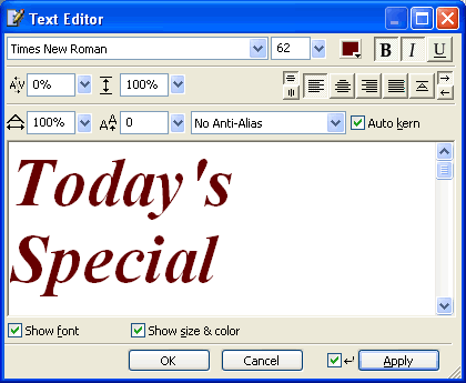
Start Fireworks. In the File menu select New. Then...

Top


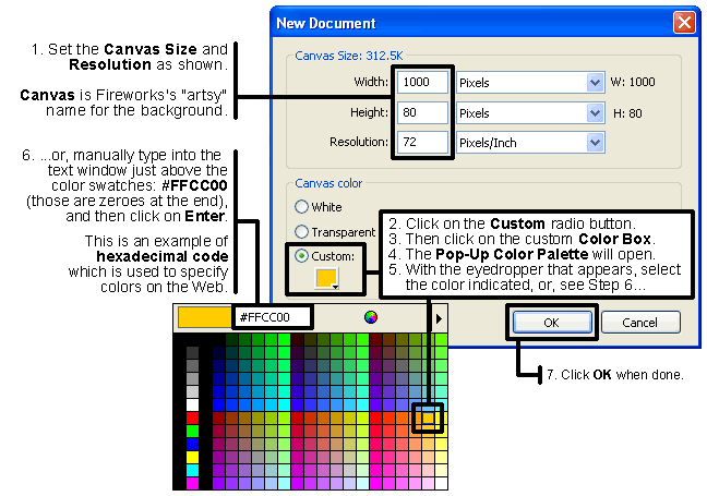
Take a moment to save your file in Fireworks' default format PNG. Save it in your images folder. Name it: BNR_yourlastname (replace "yourlastname" with you actual last name). The .png file extension will get added automatically. PNG stands for Portable Network Graphics and is usually pronounced "ping".

Make the rectangular background shapes

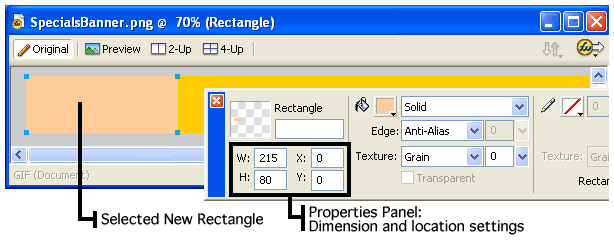
We will now make some decorative rectangles for our banner.

  1. Select the Rectangle tool. It is in the Tools panel in the Vector section, below the tool with the diagonal line (see illustration). It has a white-ish square icon (not a blue, green, or dashed line square).
    • If you don't see the Tools panel, use the Window menu to select Tools (not Toolbars).
    • If you don't see the Rectangle tool on the Tools panel where indicated in the illustration, either:
      • Press the letter U on your keyboard repeatedly until you see it,
        or...
      • Click and hold on whatever button is displayed in the Tools panel at the location illustrated. A menu will appear. Select the Rectangle tool in that menu.
  2. Next, set the Fill color:
    1. Look in the Tools panel for the Colors section, near the bottom. (see illustration)
    2. There are two bucket icons in that section.
    3. Click the Color Box (the square) to the right of the lower bucket icon.
    4. The Pop-up Color Palette will appear.
    5. Set the color to #FFCC99, which is a tan color that is slightly different than our yellow-gold background color. This can be done two ways, as mentioned previously:
      • You can use the eyedropper that appears to select the color from the palette: this time it will be the color in the second column from the right, three rows up, or...
      • Manually type into the box at the top of the palette the characters #FFCC99 then press the Enter key on your keyboard to set it.
  3. With the rectangle tool selected, hover your pointer over the background. The pointer will look like a plus sign (+). Click and drag diagonally to form a rectangle anywhere over the yellow background. It doesn't matter what size it is or where it is located, but keep it within the edges of the background. Make a shape roughly like the one pictured here:
  4. Immediately after forming the rectangle, select the Pointer Tool (the black arrow in the upper left corner of the Toolbar.
  5. Select the rectangle with the Pointer Tool by clicking on it. Tiny light blue squares will appear on the rectangle's corners indicating that it is selected.

  1. We will now adjust the rectangle's size and position using the Properties panel (see illustration above). If you don't see the Properties panel, in the main menu select: Window -> Properties.
  2. The Properties panel displays the dimensions and location of any selected object. With the rectangle selected, just click in the height and width windows to modify the size. Set it to 215 W (wide) by 80 H (high). Note that the height is the same as the background's height - this will provide a perfect fit.
    • Also note that all sizes are in pixels, the basic and smallest unit of all digital images.
    • They are the tiny squares that all digital images consist of. They are usually too tiny to see without magnification. Each pixel contains specific color information that determines its color.
    • Pixels are the de facto measurement standard for the Web. Almost all dimensions are specified in pixels.
    • A pixel is a relative size. The size that a pixel appears is based on the display resolution that one's monitor is set to.
    • For example, if your monitor resolution is set to 800x600, a rectangle of those same dimensions will fill the entire display. However, if your monitor is set to 1600x1024, then that same rectangle will occupy only half the width of the display.
    • With higher resolutions you can see more things, but they will appear smaller (and will often be harder to see).
    • If you wish to check or change your monitor resolution (Windows):
      Start button -> Control Panel -> Display -> Settings -> Screen resolution
    • FYI: the word pixel is derived from the words: Picture Element.
  3. Set the position to be Y = 0, if it isn't already. This will position the rectangle's top and bottom edges to be flush with the top and bottom boundaries of the background.
  4. You will now use the arrow keys to position the rectangle so that it is in a position about one third from the left edge of the background.
    • In order to maintain the vertical position (Y = 0), do not click on and drag the shape. Instead, use the left or right arrow keys on your keyboard to move the selected rectangle horizontally.
    • TIP: Using the arrow keys to move shapes gives you precision control when positioning objects. Clicking and dragging does not.
    • Press the left or right arrow key repeatedly until you have the rectangle in position roughly.
    • TIP: If you press and hold down the Shift key, then each time you press an arrow key the shape will move 10 pixels. Without Shift it will move only 1 pixel per arrow key press.
    • You can also position the rectangle by entering an X position of 220 or higher.
  5. We will now copy the rectangle and give the copy a different color and a different horizontal position. Again, these rectangles are being used purely for design, their horizontal position is not critical. The rectangle should still be selected, displaying the little light blue squares on each corner.
  6. Using the Edit menu, select Copy to copy the rectangle.
    • Then select Paste.
    • It will seem as if nothing has happened.
    • This is because the new rectangle will be directly on top of the one you copied, so you won't see it. However, the new rectangle ought to be automatically selected as soon as it has been pasted.
  7. Leave the new rectangle selected.
    • Now set its color using the fill color chooser in the Tools panel that you used before.
    • Specify #FF9966 in the Pop-up Color Palette that opens.
    • This color is four rows up from the bottom and in the third column from the right.
    • Alternatively, you can manually type the color number in, then press the Enter key on your keyboard to set it.
    • This is what your rectangle ought to look like:
  8. Using the arrow keys on your keyboard, move the new rectangle to a position slightly to the left or right of the first rectangle.
  9. Now you should have two rectangles with slightly different colors. The horizontal ("X") position of the rectangles is not too important, but the "Y" value of each rectangle in the Properties panel ought to be 0 (zero) and their "W" (width) and "H" (height) ought to be the same: 215 and 80 respectively . Your file ought to look something like the following (but not as small as this reduced image size):
  10. You are done with this part of the exercise!

Top


Making the text

  1. Set your view magnification to 100% by clicking on Ctrl-1 (that's a one) or using the menu: View -> Magnification -> 100%.
    • ALWAYS judge the appearance of text at 100%.
    • Otherwise you will be seeing a distortion of the way the text will appear, particularly along the edges of the letters.
  2. Select the Text tool. It is the button with the A icon in the Tools panel (see illustration of Tools panel above).
  3. Click anywhere in the image area.
  4. Type the words: Today's Special.
    • For now, it does not matter what size the text is, where it is located, or the font that is being used.
  5. Make sure that the text you just created is selected (blue outline).
  6. In the Text menu select Editor.
  7. The Text Editor dialog box will open.
    • Note: Many of the settings made in the Text Editor can also be done in the Properties panel, however I prefer the Text Editor because you can move the text around in the main window and edit the text at the same time.
    • However, many of the changes that are made in the Text Editor will only appear in the Fireworks main window, not in the Text Editor. This includes kerning, baseline shift, horizontal scale (stretch), and anti-aliasing. Therefore, check results of those settings in the main window, not in the Text Editor.
  8. Click-drag over the text in the Text Editor to select it all.
  9. In the top left corner of the dialog box select any font you like from the font menu.
    • You can use any font you like because the text will be embedded (made a part of) the image, therefore you are not relying on the client computer's available fonts (unlike html text).
  10. In the box to the right of the font listing, set the size to about 62.
    • Any size is acceptable however the text must remain within the boundaries of the background (the yellow Canvas) area.
  11. Next, use the Color Box in the Text Editor to set the text color to one similar to the color in the illustration below (#660000 - which is in the top row, sixth from the right).
  12. Set the font to be bold (using the "B" button) and italic (using the "I" button). Don't close the Text Editor yet, there's more to be done with it next.

  13. Continuing in the Text Editor, find the drop down menu that controls the text's Anti-Aliasing Level setting.
    • Anti-aliasing means creating a blend of color between the foreground (text) color and the background (Canvas) color to give the visual illusion of smoother edges on the diagonal and curved edges in the text.
    • IMPORTANT: As mentioned previously, you can only view the effect of the Anti-Aliasing Level in the main window of Fireworks, not in the Text Editor. (Also, your view size must be 100% in order for you to make an accurate judgment, as specified in Step 1).
    • Change the Anti-Aliasing Level to one that you think makes the text look the best. Choose from the top four options in the drop-down menu. Those options are listed below:
      • No Anti-Alias (this will probably appear the worst of the four)
      • Crisp Anti-Alias
      • Strong Anti-Alias
      • Smooth Anti-Alias
  14. Continue to leave the Text Editor open.


Kerning

To kern means to increase or reduce the gap between selected letters to make words look better. This is important to do with large text such as what you have created. The Text Editor allows you to do this.

  1. First, click in the gap that you want to adjust. You might want to try adjusting the gap between the "y" and the apostrophe which may be slightly wider apart than needed.
  2. Look in the Text Editor on the left side underneath the font name for the following label characters: A\V.
  3. To the right of these letters, click on the downward pointing arrow.
  4. Use the slider that appears to make adjustments until it meets your approval visually.
    • You will not see a change as long as the slider remains visible. So, after you make your setting, click away from the slider so that it will go away in case it remains visible.
    • You will not see the gap between the characters change in the Text Editor, but you should see the change in the text in the file's main window.
    • A setting of only -4 or so may be all that you need.
  5. Click OK to close the Text Editor.
  6. Use the Pointer tool to select and position the entire block of text where you want it.
    • You can refer to the illustration of the banner in the "Add another picture" section further down on this page for an approximate position. NOTE that the example image is reduced in size and therefore will appear much smaller than your file will appear.
    • If you cannot see your entire banner but would like to do so in order to make it easier to position the objects, do the following:
      • Ctrl + 5 will reduce the magnification of your image to 50%. This should allow you to see the entire banner.
      • Then use your Pointer tool or arrow keys to position the rectangles or text to where you would like them to go.
        • You may want to temporarily use the Select Behind tool to make it easier to select the rectangles that are behind the text in order to move them. You can get this tool by clicking and holding on the Pointer tool in the Tools panel and selecting it from the menu that appears.
        • To use the Select Behind tool to select a rectangle (in order to move the rectangle), click once or twice on the rectangle until you see the little blue squares on the rectangle's corners, indicating that it is selected. Then use the arrow keys on your keyboard to move the rectangle left or right into an appropriate position.
        • When done using the Select Behind tool, reselect the Pointer tool in the same way that you selected the Select Behind tool.
      • Return magnification to 100% using Ctrl + 1 (that's a number one).
  7. Save the changes that you have made so far by using:
    • Ctrl + S or...
    • File -> Save

Top


Adding transparency to a GIF file

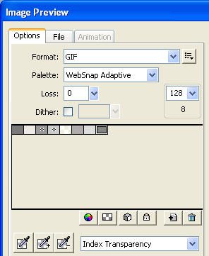
Next, we will take an old-fashioned illustration of the sun and remove the lighter colors from it so that we can see our yellow background color come through while retaining the darker colors to keep it looking like a sun. See the group of three illustrations below of the sun. It shows the progression of the image as it has color removed from it replaced by transparency. The transparency allows the yellow background to come through.

The GIF image file format allows you to select one or more of the colors in an image and remove them, leaving transparency where the color had been. If the image is then superimposed over a color background, the background color will be seen through those transparent areas.

Note that GIF = Graphics Interchange Format. It is pronounced "giff" with a hard or a soft G.

We want the yellow color of our banner's background to be seen through all but the darkest parts of an old-style illustration of the sun that initially has a white background.

  1. Download the zip file linked to at the very beginning of this tutorial.
  2. Put the two files that are inside of it (asparagus.jpg and SunBefore.gif) into the images folder you created.
  3. Using Fireworks' File menu, open the image file of the sun: SunBefore.gif
    • You can leave the BNR_yourlastname.png file open.
  4. Then, go to: File -> Image Preview
  5. In the Image Preview dialog box that opens, in the upper left section, from top to bottom make these settings if needed:
    1. Format: GIF
    2. Palette: WebSnap Adaptive
  6. Then, underneath the color palette area, select: Index Transparency.
  7. Your settings should look like the following. Note that one of the small color swatches has a light gray checkerboard pattern in it. That is the universal graphics symbol for transparency:

Fireworks assumes that we want to make only the white color transparent, because it is the predominant color. Therefore, initially, only what was the white area has been made transparent.

As mentioned above, transparency is traditionally represented in graphics programs such as Fireworks by a gray and white checkerboard pattern. If you look closely you will notice that not only does the small color swatch have that gray and white checkerboard, but that the pattern also appears behind the sun in the image preview area on the right side of the dialog box.

There is a problem with setting only the white area to be transparent. If the image were to be placed against the yellow background, a light colored fringe will be visible (see middle illustration below):

Before Transparency:
T
he image consists of the colors white and gray plus many in-between shades along the edges of the gray shapes.
Inadequate Transparency:
Look closely and you will see a light colored fringe around the gray shapes. This indicates that not enough of the light gray colors have been removed.
Adequate Transparency:
The only colors left are the dark grays.

That fringe consists of the light gray color pixels that remained in the image after the white pixels were removed when the transparency was initially set. Those colors can be seen on the left side of the dialog box in the color swatches. Those are the gray color swatches that the image now consists of.

You may not think that there are that many colors in the image because it looks as if the remaining shapes are a uniform dark gray. However, if you were to look closely at the edges of the dark gray shapes, you would see pixels with those colors. Here is a picture of some of those remaining pixels greatly enlarged:

Because of this, we need to select the light grays that remain in the image and designate that they too be made transparent. The darker grays that remain will be enough to adequately represent the image of the sun.

  1. Click on the "+" eyedropper tool on the left side of the Import Preview dialog box.
    • It is the middle eyedropper, the one that will display the tool tip "add color to transparency" when you hover over it.
  2. Then use that tool to make transparent the lighter colors by clicking on them. Click on all but the two or three darkest grays in the group of color swatches.
    • This step will make the gray colors that get clicked on transparent.
    • The color swatches will change to the light gray and white checkerboard pattern as you click on them, indicating that those color pixels have been made transparent.
    • Again, this is being done because removing the lighter grays by converting them to being transparent will prevent the fringe of light pixels from being seen when we put this image on top of the banner's yellow background color.
    • All but the two or three darkest grays ought to remain.
  3. Luckily for you, this file is already the exact size for the height of the banner: 80 pixels high, so you need not be concerned with changing the image size.
  4. Click on the Export button in the bottom right corner of the Image Preview dialog box.
  5. In the Export dialog box that appears:
    • Change the File name to: Sun
      • The .gif file extension will be added automatically therefore you do not need to add it.
    • Save the file in your images folder.
  6. Click on Export.
  7. If the Image Preview dialog box remains open, click on OK to save the export settings that you made.
  8. Save SunBefore.gif and close it.

Top


Put the sun on your banner

  1. Open the file you just made (Sun.gif) in Fireworks using File -> Open.
  2. Press Ctrl + A on your keyboard to select the image. A thin light blue borderline indicates that the sun is selected.
  3. Then use Edit -> Copy to copy it, or else simply use Ctrl + C.
  4. In Fireworks, use the bottom of the Window menu to select to the file BNR_yourlastname.png
  5. Paste the sun on the banner using Edit -> Paste, or Ctrl + V .
  6. With the image of the sun that you just pasted selected (blue outline), use the Properties panel, to set both the X and the Y to 0 (zero). This will move the sun image to the far left edge of the banner and position it flush with the top and bottom edges of the banner.

Add another picture

  1. Using Fireworks' File -> Open menu, open the other file that was originally in the zip file: asparagus.jpg. It should be in your images folder.
  2. Use Ctrl + A to select the image. It should have a thin, light blue borderline around it indicating that it is selected.
  3. Use the Edit menu to Copy the image.
  4. Go to your banner file.
  5. Use Edit -> Paste to paste the image of the asparagus down. It will probably be put on the far left edge of the banner, directly on top of the sun image.
  6. Using the Properties panel, set its position to be X = 108 and Y = 0.
  7. Now use the Pointer tool to select and the arrow keys to position the rectangles and text into positions that you are happy with.
    • You can use the illustration below as a guide if you are not sure what you like.
  8. Now use Ctrl + S to save the BNR_yourlastname.png file. It should look something like the image below (but larger).
  9. But wait! There is more. Next, is slicing, read on...

Top


Slicing the banner

Image slicing carves up an image into smaller pieces. It is used for a few reasons, including these, which are what we will be using it for:

  • It can divide up a single image into parts so that links may be added to a section of the image.
  • It is used to optimize (set the file type and size in KB) different parts of an image by using different settings for the different slices.
  • It can also help the overall image seem to load faster because smaller images load in their entirety faster than larger ones.

Slicing divides up the image into several smaller image files. It also generates an html file with coded instructions on how the slices are to be reassembled using an html table.

An html table is a set of rows and columns created in html that you can use to hold images, text, and other objects. Each compartment of it is called a cell (similar to Excel).

For your information, there are three html table tags all of which must be used in order to form a table: <table>, <tr> (table row), and <td>, which stands officially for table data, but simply means a single cell.

The table (the html code and images) that we will create using slicing can be used in other html pages if so desired. That is what might be done in a situation such as this. Our sliced banner could be placed in another page that has additional content such as a picture and description of the day's special.


  1. The first step is to select the Slice tool on the Toolbar (see illustration).
  2. Next, click-drag over the sun from its upper left corner down to where it meets the bottom left edge of the image of the asparagus.
  3. As soon as you have made the slice, select the Pointer tool by pressing the V key on your keyboard or selecting it from the Tools Panel. It is a good idea to do this so that you do not accidentally continue to make tiny slices every time you click your mouse button.
  4. The image area over the sun ought to now be a transparent green, indicating that it will be made into a slice and also making it available as a hot spot for linking to another web page, which we will do.
  5. Select the green slice using the Pointer tool. The green area should have a light blue borderline if it is selected (see illustration above).
  6. Look at your Properties panel.
    • If for some reason you do not see your Properties panel, go to Window -> Properties.
  7. Check that the slice is 80 pixels high (H) and also in position X=0 and Y=0. If not, then enter those numbers into the Properties panel.
    • You can also use the Pointer tool to click and drag on the handles on the slice's corners to adjust its shape. However it can be a little awkward to adjust the size with precision in this manner.
  8. To create a link, enter into the Link field in the Properties panel the web address of an actual web site so that we can test the link, being sure to include the prefix: http://
    • Example: http://www.google.com
    • Note: typically clicking on this part of a web page (the upper left corner) would usually go to the site's home page.
  9. Also in the Properties panel is set the Target drop down menu. Set it to _blank. This will cause the link to open in a new window.
  10. With the Slice tool selected, click, and drag over the photo of the food. Now you should have a second green area indicating that the photo will be a separate slice. We will optimize the photo slice as a JPEG and the other slices as GIF files in a moment.
  11. Finally, click and drag over the remainder of the banner, which will be the entire area to the right of the photo. Now you should have a total of three green slices with every part of the banner covered by one of the three.
  12. Set the optimization settings using the Optimize panel. If you don't see it, go to the Window menu and select Optimize.
    • Using the Pointer tool, click on each sliced section, one at a time, and check its settings.
    • Set the slice over the photo of the asparagus to JPEG - Better Quality, 80% Quality.
    • Set the other two slices to GIF WebSnap 128.
    • Leave the other settings as you found them.
  13. Once that's done, go to File -> Export which will open the Export dialog box.
  14. In the Export dialog box, make the following settings (and don't save the file until you are told to do so!):
    • At the top is: Save in:
      • Create a new folder inside your images folder.
      • Name the new folder slices.
      • Then open the slices folder so that you will save the exported files in it.
    • Continue to set the Export dialog box as follows (some of these settings may already be established so you probably won't need to change them all):
      • File name: banner (you don't need to add file extensions, Fireworks does it for you).
      • Export: HTML and Images
      • HTML: Export HTML File
      • Slices: Export Slices
      • The checkbox for Include Areas without Slices ought to be checked.
  15. Click on Save and remember the location where you are exporting the files to.
  16. Open in your Web browser (Internet Explorer, Firefox, Safari, or any other) the html file that was just created in the slices folder, using the browser's menu: File -> Open.
  17. You should see it all perfectly reassembled and the link ought to work.
    • NOTE: The area outside of the banner will probably be colored the same as the banner's yellow background color. This is normal. It will not matter because our intention is to insert only the banner's table into another html file and not the rest of the background.
  18. Online students and those submitting this as homework for a classroom class:
    • Save and then send me the Fireworks .png file only. It should be named BNR_yourlastname.png
    • Include in your email subject line the course code if you have been given one at the start of the course (and you probably were). If you don't know where it is:
      • Classroom students: check your course outline.
      • Blackboard students: check for the course code in the Course Information section in the page: Email, Subject Line, and File Naming Rules.
    • Also include the subject line the letters: BNR

Congratulations, you did it!


Top

© 2007 Dan Hitchcock Vaughan and its licensors. All rights reserved.